UASLP - AMT 
Detalles
Optica Normal
fuente img.
Año 2009
Créditos Manuel Guerrero
Descripción

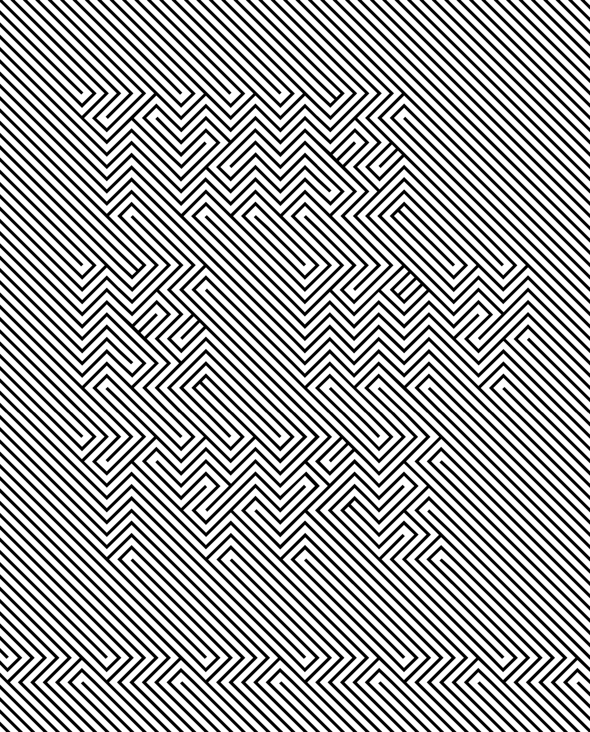
OPTICA Normal es una fuente tipográfica construida con la ayuda de líneas ortogonales ensambladas en un orden fijo. En este juego óptico podemos percibir una textura de patrón pero si analizas las direcciones de línea verás el texto dentro. Este tipo funciona mejor en tamaños grandes. OPTICA Normal es un homenaje al arte óptico del artista colombiano Omar Rayo.
JUGDGE’S CHOICE | RICHAR KEGLER
The premise of Excellence in Type Design made the judging of the 165 entries difficult. There were many designs that demonstrated skill and understanding of type design to a level of excellence but were still eliminated for various reasons. Perhaps the field of type design grows so much every year that the cumulative pool of designs make the truly unique and exceptional harder to reveal themselves. To contribute something new to such a studied and focused field risks failure or redundancies at every turn.
This entry was thought at first to be possibly a put-on. It wasn’t until several hours of judging and returning to this design bleary-eyed that the letters finally emerged for me. Before then, it was simply an engaging piece of op art. The seamless lockup as a solid field of intersecting lines at 90-degree angles, even in the negative space, creates something quite jarring. As a readable, functional font, it is, well, not. As a display face, it is unique, clever, and once deciphered, very memorable. The level of engagement is the polar opposite of Beatrice Warde’s “Crystal Goblet” treatise. It was unknown at the time of judging that the designer was from Mexico, but the Aztec-Mayan pattern filtered via the Mexico ’68 Olympic identity system seemed to be the clearest precedent for this, making it culturally authentic as well as excellent.

Distribución Acceso público con costo
Clasificación Experimental
Familia(s) Optica Normal
Formato otf
Estilos 2
Lenguajes Español, Inglés, Francés, Italiano, Alemán, Portugués, Catalán, Sueco, Noruego, Danés, Holandés, Rumano, Esperanto, Gallego, Euskera
Glifos menor que 256
Set Básico
Estudio BlueTypo
Fundidora BlueTypo
Enlace https://bluetypo.com/site/es/2017/04/21/optica/
Reconocimientos Type Directors Club. Jugdge's Choice 2008, Type Directors Club. Certificado de excelencia 2008, Bienal de Tipografía Latinoamericana. Certificado de Excelencia 2010, Designpreis Deutschland Nominee 2010
Palabras clave arte optico, experimental, lineal